6 ways to Boost mCommerce Conversion
Article topics
- What is mCommerce conversion rate optimisation?
- The mCommerce revolution
- Pain points for mobile CRO
- Final thought
In some sectors mobile has well and truly overtaken desktop as the preferred way to shop online. Consumers are demanding mobile-friendly shopping experiences, for the convenience and technological benefits that mobile affords. That’s why eCommerce brands and businesses need to ensure that their mobile webstores are optimised for conversion.
What is mCommerce conversion rate optimisation (CRO)?
mCommerce, or mobile shopping, has many of the same CRO challenges as desktop, yet it also has some of its own specific CRO criteria. Page load speed, navigation and the way consumers interact with a much smaller screen can create mobile-specific pain points. Addressing these issues to offer lower friction journeys will help increase consumer engagement.
This article will explore some of the ways brands and businesses can optimise their mobile webstore for more streamlined and intuitive shopping experiences.
The mCommerce revolution
Mobile as a total share of global eCommerce sales is rising fast. It’s projected to surpass desktop eCommerce in 2021 with 54% of sales. That’s why it’s important for brands and businesses to ensure that their webstores are tuned for mobile devices and omnichannel shopping, to capitalise on fast-changing consumer behaviour.

Yet a recent report revealed that as few as 12% of consumers find mobile a convenient way to shop. This seems counter intuitive given that mobile is projected to soon overtake desktop. And it provides insight into the mobile shopping experience—if so many consumers are shopping on mobile, with so many of them having less than outstanding experiences, then that indicates a massive opportunity for brands and businesses who implement well executed CRO to gain a competitive edge on competitors who are slow to react.
The ‘mobile first’ ethos is becoming the new normal for website design, with developers creating webstores specifically for mobile and then working the mobile design for desktop. This is the reverse of how things have been historically, where designers create for desktop first and then tweak the design for mobile, almost as an afterthought.
Where are the pain points for mobile CRO?

1. Page load speed
When it comes to how fast pages load, mobile conversion suffers with two issues. Firstly, there’s the fact that phones have less processing power than desktops or laptops. Secondly, by their nature, mobile devices rely on wireless connectivity, whether that’s Wi-Fi or mobile phone signal. Both of these issues can significantly impact page load speeds.
When consumers use their mobiles to shop, they are often on the move, in a public place, cafes, bars or on public transport, or any of a hundred different places, where internet connection might not be good, where there might be distractions. All this adds up to a very different shopping experience when compared to sitting in front of a big screen in the quiet privacy of home, where your webstore has consumers’ more focused attention. With mobile, it can be difficult to maintain consumer engagement.
Research by Google revealed that 53% of mobile website visitors will navigate away if pages take longer than just 3 seconds to load. The Google report also showed average load time for mobile sites is 19 seconds on 3G and 14 seconds on a 4G connection. Although 5G is expected to reduce page load times, it’s unlikely to bring the average anywhere near 3 seconds.
The key to speeding up mobile page load is to optimise the render start time, enabling caching, optimise and compress images, and minimising JavaScript and HTML. The simpler and cleaner your pages are, the faster they will load.
Another way to increase mobile page load speed, and to offer consumers a more unified shopping experience, is to use progressive web applications.
2. Progressive web applications (PWA)
Webstores built using PWA are up to 4 times faster than dynamic, non-PWA webstores. The idea behind PWA is to offer native app shopping experiences without consumers having to download the app, store anything on their phone or perform manual updates. This in itself helps reduce friction and lifts CRO. PWA webstores can maintain faster load time with lower quality connectivity.
Another important benefit of PWA is that it gives consumers unified shopping experiences, maintaining continuity between mobile and desktop webstore renders, meaning that consumers only need to become familiar with a single version of your webstore rather than becoming used to your desktop rendering, and then being tripped up by the native app version.
How fast is your webstore loading on mobile? Use Google Page Speed Insights to find out.
3. Outstanding UX
The less friction there is in your webstore’s navigation, and the more intuitive shopping journeys are, the higher conversion will be, leading to more satisfied customers and repeat purchases. Happy customers are more likely to talk about your brand, products and services favourably on their social media channels and on review websites.
4. User interface
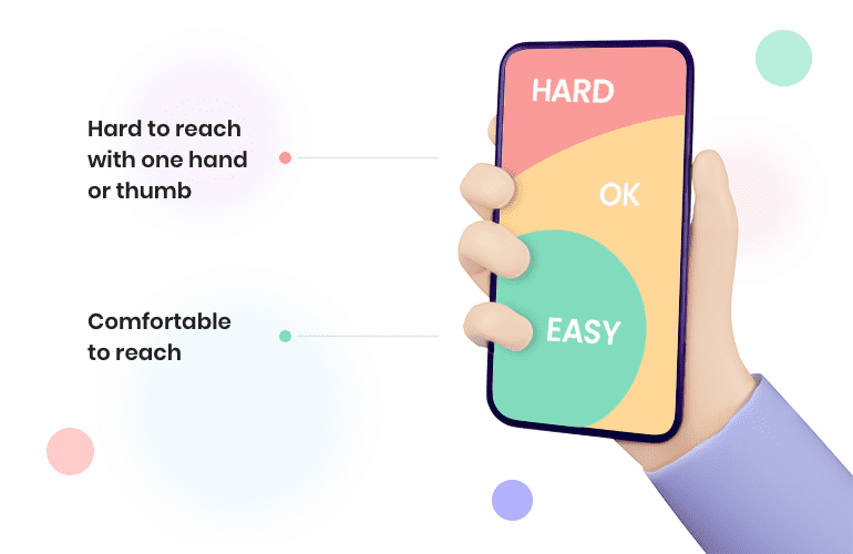
A major factor in mobile user interface design (UI) is the small size and the shape of phone screens. This limits the way in which consumers are able to interact with your webstore. For example, the portrait orientation of a phone screen requires different UI to desktop. And text must be an appropriate font style and size, and minimal to keep the smaller screen looking clean and uncluttered. To overcome this and optimise for conversion, mobile specific UIs are used, such as hamburger menus and large tap-targets, particularly on homepages.
Mobile webstore page layout must take into account that consumers will be tapping and swiping, as opposed to using a mouse. This means pages should be simple and uncluttered, giving enough space around UIs to accommodate clumsy fingertips, with large, clear buttons, links and CTAs. Button hover isn’t possible on mobile either.
On mobile, visual feedback is important for consumer engagement and conversion. When a consumer taps a button there should be a change to show that the action has been successful and the page is working. This can be a colour change or button indent. If a consumer doesn’t get that visual feedback, they may think the page has frozen, become frustrated, and tap away from your webstore.
Mobile shopping gives brands and businesses the opportunity to offer consumers UI features that they don’t see on desktop: using tap-to-call phone numbers, store locations opening in maps, social media links, digital wallet, QR codes, the list goes on. These mobile specific UIs help boost conversion by streamlining shopping experiences to better engage consumers.
5. Search
Consumers being able to easily find what they are looking for in your webstore is fundamental to good CRO. Search bar optimisation includes functionality such as autocomplete, which will prompt consumers who are perhaps not entirely sure what they are looking for by finding the most likely matches.
Enabling your search to look for synonyms and hypernyms to show related products can offer consumers useful alternatives. The search bar should be clearly displayed at the top of your mobile homepage with the ubiquitous magnifying glass icon—this is what consumers expect to see and it’s universally understood to mean ‘search’.
Filtering search results is another way to guide consumers to products or services provided by your webstore. Common filters are: by popularity, highest rating, prices, location to the consumer, the list goes on and will depend on the nature of your business.
One thing to absolutely avoid is a search that delivers zero results. That is likely to drive consumers towards your competitors.
There are consumers who prefer not to use a dedicated search function and instead prefer to navigate to find what they want, so while a search bar is vital, it’s also really important to enable consumers to intuitively find products and services by navigation
As omnichannel shopping becomes more prevalent and the divide between online/offline shopping dissolves, new ways to search for products and services are emerging when shopping using mobile devices, such as image search and augmented reality.
6. Image and video
Images that show different iterations of a product, such as colours, sizes or types will help increase conversion.
Using high quality, relevant and appealing images in your webstore will certainly help boost conversion. But they can also have a big impact on your page load speed. Ensuring images are the appropriate file type, are the right size for their context and are optimised will help speed up page load.
Naming images for improved SEO will help get your webstore higher up in search results, meaning more consumers will be exposed to your brand and business, driving traffic to your webstore. And a well optimised webstore will often see higher conversion rates.
Video is a great way to engage consumers. Short, high quality videos will help increase the time that consumers spend browsing in your webstore—engaged consumers are more likely to convert.
Final thought

The idea of having a separate mobile and desktop webstore is becoming an anachronism, whether that’s a desktop webstore reworked for mobile or a native app. It can also cost more to develop two ways for consumers to interact with a webstore. And it’s at odds with the idea of omnichannel shopping, offering consumers seamless, unified shopping experiences.
Boosting mCommerce conversion rates comes down to engagement. By having faster page load speeds, not creating a mobile offering as an ‘after thought’, not forcing consumers to download an app, ensuring that UI is intuitive and doesn’t trip consumers up, and finding products and services easily in your webstore, consumers and your customers will be more likely to stay engaged, and be more likely to convert.
Is your mobile webstore optimised for conversion? If you would like to know more about mCommerce CRO get in touch today for a chat with one of our mCommerce CRO specialists.


 Back
Back