Sage Business Cloud People delivers amazing workforce experiences
Sage People is a human resources cloud platform for managing business recruitment, from acquisition and onboarding to training and retaining employees. It enables HR professionals to manage recruitment needs as their organisation evolves and expands.
Service overview
The challenge
We were approached by Sage People to transform their website, to bring it on brand with sage.com and to rework some user interface and layout elements, for a fresh new look and improved user experiences.
The previous Sage People website had some outdated UI elements, unintuitive page layouts as well as older colour schemes, fonts and font sizes. We were also briefed to refresh the consolidate user resources and to rework the News
Hub section.
News Hub redesign
The News Hub underwent a major re-think. It was completely redesigned for more engaging UX. This included updated look, revised layout and structural redesign.
News Hub’s new look is on brand with the sage.com blog, with the new approach highlighting featured and popular news articles. Events news and PR releases are included here too so that all news can now be found in one place.
User friendly carousels
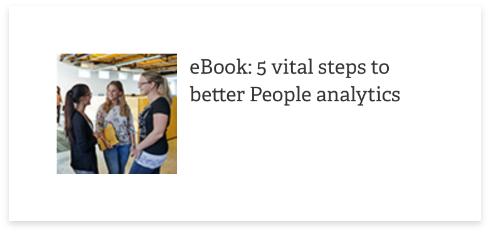
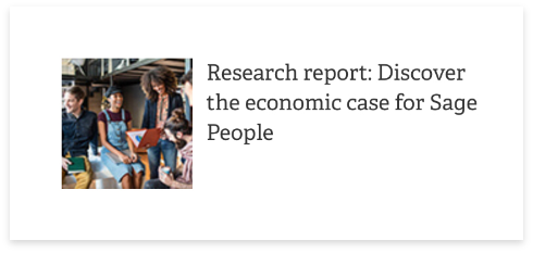
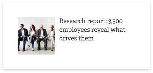
We included updated carousels, offering users quick and easy access to news, reports, ebooks, articles and other valuable insights. The new carousel design has a lighter look with slicker interface for faster access. This simple addition to the Homepage helps reduce journey friction, increasing user engagement.

Quick info tabs
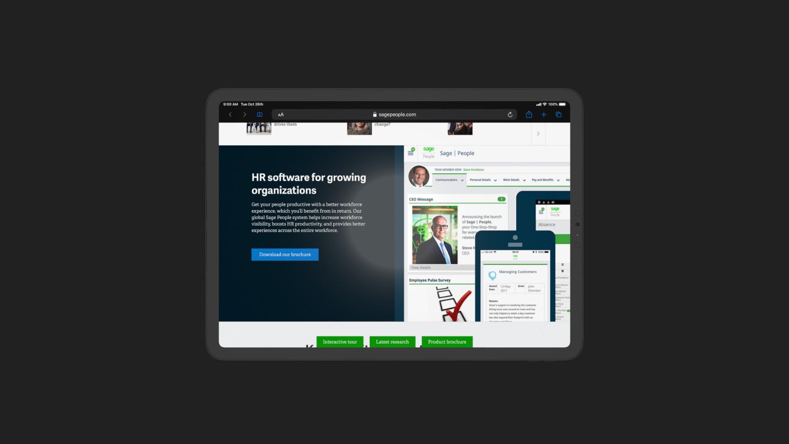
On the Homepage and Product pages three tabs were introduced that enable users to quickly and easily access important information. The tabs take users directly to an Interactive Tour, Latest Research pages and Product Brochure download. The tabs are on top of the page so are always visible to users while they are on the Home and
Product pages.

Product pages
The Product pages now include new hero images as well as a style rework to bring them in line with sage.com. A new design layout gives this section a more engaging, user friendly feel, improving user journey. We also updated product child pages to bring the design and layout on brand.

Push notifications
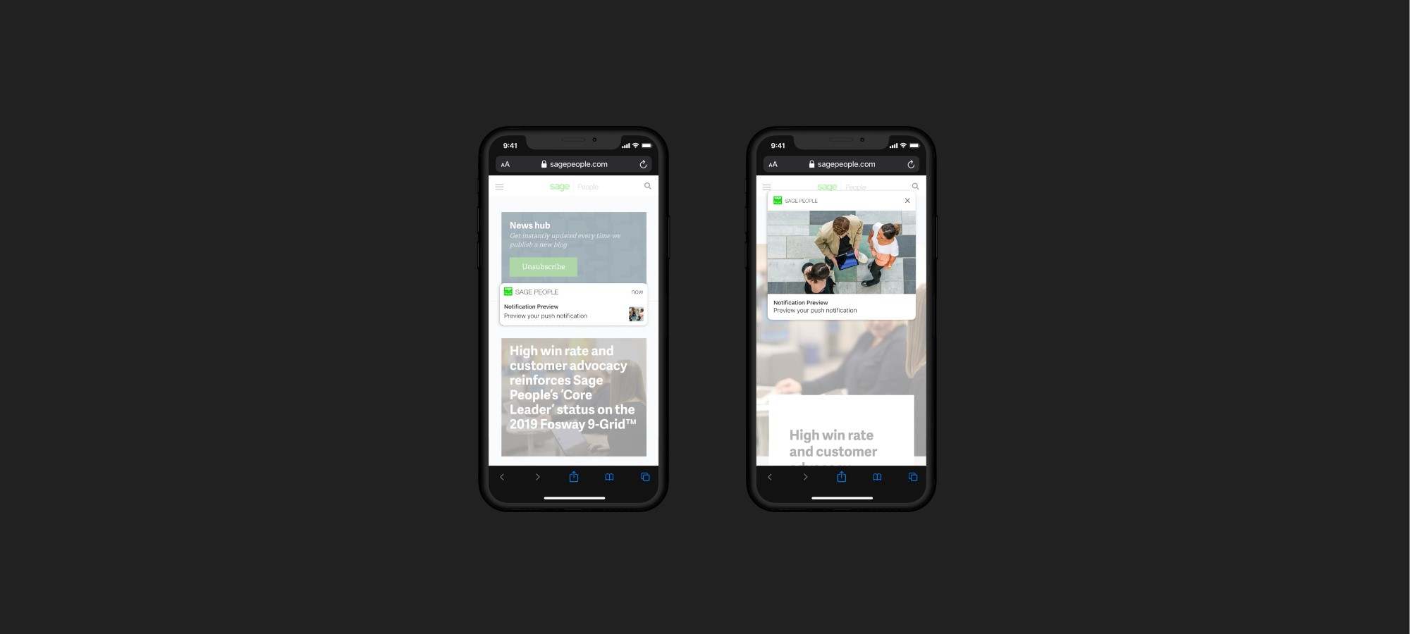
To help improve engagement we implemented push notifications to notify users when new content becomes available or for other communications, such as new products, articles and events information.
Easier to find resources
We reworked the Resource section so users can now easily find information and data such as case studies, reports, datasheets, videos and white papers. We redesigned the section to bring all resources into one location for consistency and to make finding recourses easier.
New elements were introduced into the Resource section, including page hero banner and imagery. This gives the section a modern look and more cohesive feel, improving UX. Additionally, the Resource section child pages received new, more functional hero banners, with cleaner categorisation and more engaging font styles.
Website transformation projects are always an exciting challenge. Sage provided clear direction and the autonomy required to achieve a great result. We love working with Sage due to the smooth communication and the consistent trust in our expertise knowledge and feedback.
James Pruden
Managing Director, Xigen

Conclusion
The Sage People website transformation project enabled us to create some highly beneficial enhancements to UI and layout design, bringing the website not only fully on brand with sage.com, but providing more user-centred experiences.


