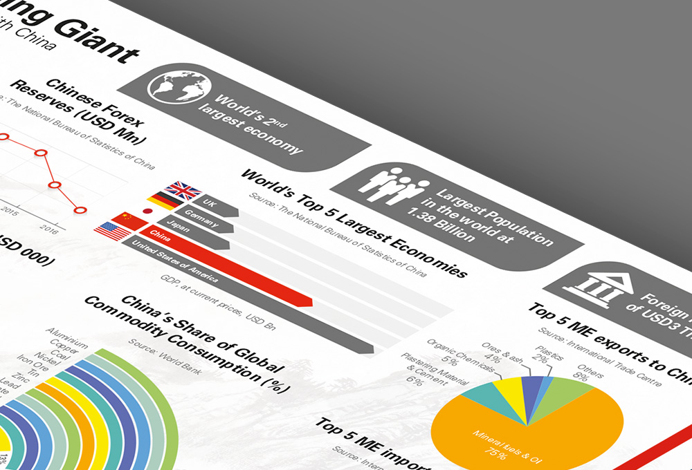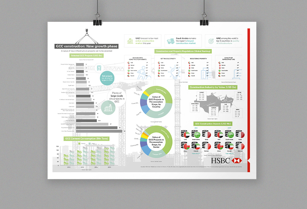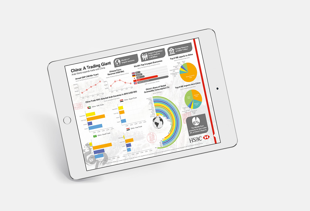
We designed a number of infographics for HSBC.
We used data supplied on specific business areas.
Goals included:
- Gaining a full understanding of the data to correctly interpret its overall significance, e.g. one country being consistently more successful than the others.
- Making the infographic visually appealing was of the highest priority.
- Producing an immediately apparent theme.

Challenge

Much of the data was quite complex and required careful study in order to find the best approach for in the infographic
Some of the data sets lent themselves well to straightforward presentation in the form of a bar chart or line graph but there were others where we felt we could introduce some interest through the use of different icons, such as coin stacks or even cement trucks where the subject was construction. It was of course important that the values could still be read and it wasn’t just the design of the graphs themselves we needed to consider here, we also had to strike the right balance with the opacity of the background image to avoid obscuring any elements.
Outcome

Iconic presentation
By looking at the data differently, we were able to create thought-provoking designs and enhance the graphics through our use of colours and thematic background designs. We also selected key facts to feature around the graphs and used flag iconography to really bring the data to life.


